City of Las Vegas Unveils New Logo, Complete With Sweet Googie Stars
We tend not to get too worked up about logo unveilings, but this one caught our eye. Because Las Vegas!
The City of Las Vegas just shared its new official logo, an update of one they’ve been using since 1979.
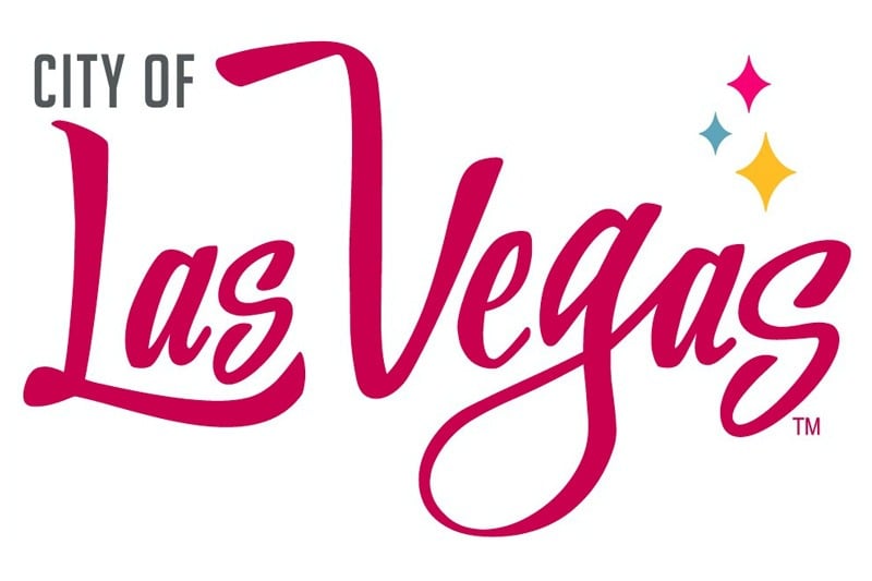
We love it! The fancy font has the expected Las Vegas flair, but we especially love a subtler design element, the three Googie stars.
Googie, of course, was a space-age style of design wildly popular in the 1960s. One of the most famous signs ever made, the “Welcome to Fabulous Las Vegas” sign, was done in the Googie style.
This blog is a particularly big fan of Googie stars, and we made sure our logo features them prominently.
Frequent visitors to our site will note we use blurred Googie stars as our background image. Note that the colors of those stars closely match the ones on the City’s new logo.
How’d that happen? Well, we’ve got this.
We drew inspiration for our Googie star color combination from another well-known Las Vegas sign, and we suspect the designer of the City’s new logo (Victoria Hart of Pink Kitty Creative) did, too.
That sign sits in front of the Neon Museum.
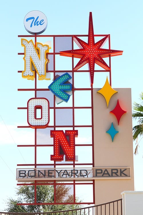
The Neon Museum’s sign, in turn, was inspired by yet another classic Las Vegas sign, that of the Stardust Casino. That sign featured dozens of Googie stars using the same three colors chosen for the Neon Museum sign and the City’s new logo, except with white stars thrown into the mix as well.
Now, you know!
It’s also interesting to note something our pal Marc Meltzer of EdgeVegas.com pointed out. The City’s logo is also reminiscent of the logo of the Pittsburgh Steelers. We’re fairly sure they’re a sports team of some sort.
According to the Steelers Web site, the Googie star shapes are called “hypocycloids,” which we’re fairly sure will be the name we use if we ever form a band. Good job making us learn something new, City of Las Vegas.
We think the City nailed it with their new logo, and not just because we love the word Googie so much. Probably.
Update (8/9/17): The City of Las Vegas has dropped its use of the new logo. Some City officials found the logo confusing, and decided to discontinue official use of the logo to “project a consistent and unified image.”



Leave your thoughts on “City of Las Vegas Unveils New Logo, Complete With Sweet Googie Stars”