The Quad: What a Difference a Wrap Makes
The Quad has undergone some dramatic changes from the days when it was the Imperial Palace. The aging hotel’s Asian theme was slowly removed, inside and out, in late 2012 and early 2013, to make way for an updated look.
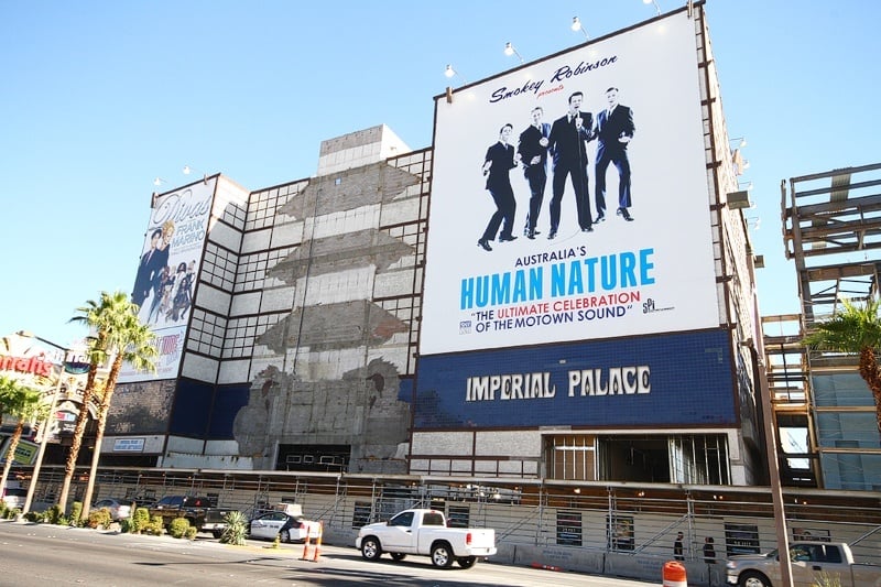
Here’s the result of the Quad’s exterior redesign.
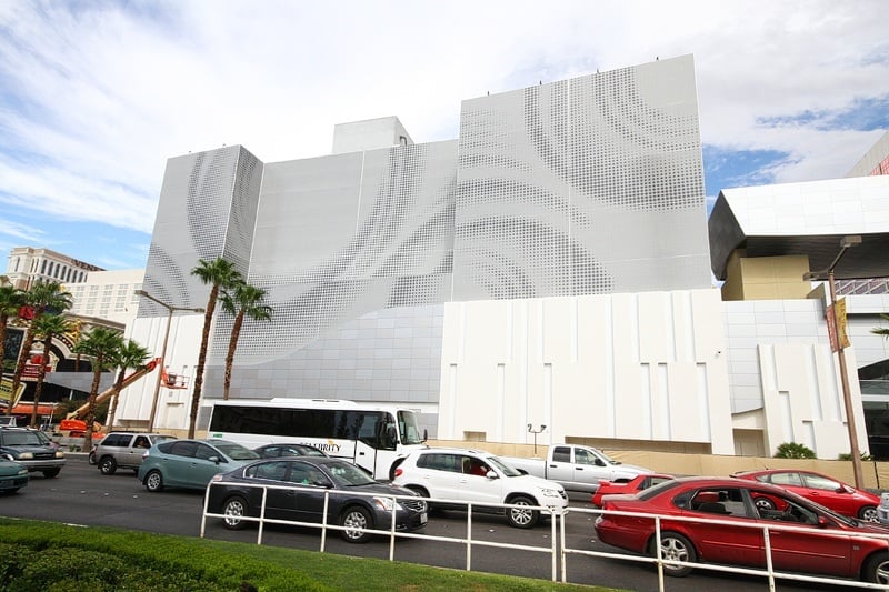
While not everyone’s in love with The Quad’s new look (change is hard, and lots of people have fond memories of the IP’s cheese), the exterior renovation was done cleverly, given a tight budget, as hotel renovations go.
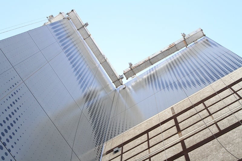
The majority of The Quad’s new look is, in essence, a massive building wrap.
Metal “frames” were installed on the walls (see below), and the building’s exterior material is attached to those frames. They’re not too different from the building wraps used when the IP was advertising “Divas Las Vegas” and Human Nature on its facade. (Human Nature is now at The Venetian, by the way.)
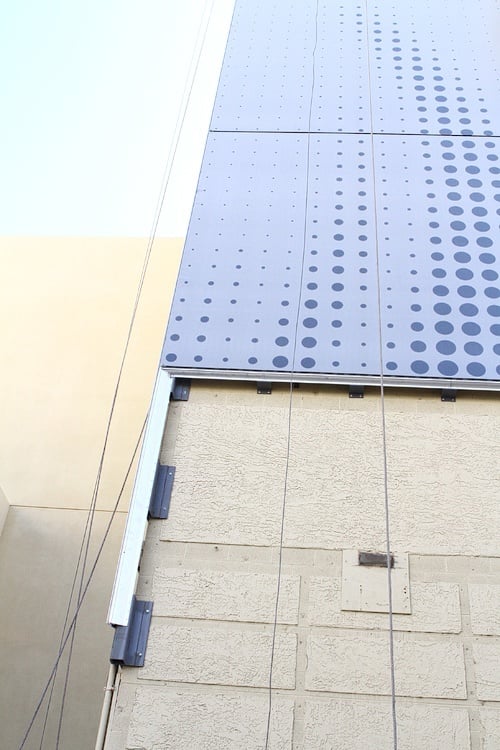
There are some challenges with this kind of superficial upgrade. One, it feels temporary and a little cheap (because it is). Two, it’s vulnerable to weather damage and fading. (Remember how the Paris balloon looked after awhile?) Three, it’s not exactly the kind of thing that would’ve been done when Las Vegas was a “Spare no expense!” kind of town.
Oh, well, it’s certainly different, and it makes The Quad a much better fit for the adjacent Linq project than the Imperial Palace would’ve been, even spruced up.
On the upside, the “lite” version of an exterior revamp meant more could be spent on the hotel’s interior. The casino part, anyway. The rooms still haven’t been touched, but we hear a room renovation could begin within the next year or so. Here’s a walk-through of The Quad’s new casino.
Could The Quad’s exterior be swapped out with ads to subsidize the hotel’s room renovations? Don’t laugh. Caesars Entertainment, which owns The Quad, is looking to sell the naming rights to its High Roller observation wheel next door.
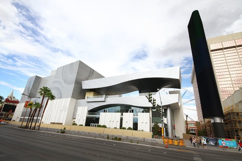
Another upside: If The Quad wanted to change its look again, it probably could, virtually overnight, just by swapping out its “skin.”
What do you think of The Quad’s new look, and since it could be changed easily (think of it as a giant cell phone case), what should The Quad’s next exterior theme be?


Leave your thoughts on “The Quad: What a Difference a Wrap Makes”
1 Comment