Casino Design: The Sneaky Tricks That Make You Spend More

There’s something so luxuriating about walking into a casino. Being greeted by the sweet aroma of excitement and the bright, glittering lights promising you a slice of heaven if you play your cards right.
And guess what? None of that’s accidental.
Casinos have been cleverly designed in a way that plays on the weaknesses of human psychology to make sure you spend as much time there as possible.
Sure, we love the free drinks and the awesome comps they offer but there’s so much more to it than that. These methods that they use to keep you in the building – and playing all night long – run way deeper.
Read on to find out about how the design and layout of the casinos keep you playing for longer.
The Evolution of Casino Design
Over the last few decades the way we play in casinos has changed a lot. The super casinos of today hadn’t even been imagined in earlier days.
Whereas before you’d have found gaming machines as soon as you walk in, nowadays it’s not unusual to walk into an elegant lobby. It’s constantly evolving to maximise pleasure – and profits.
There are two main schools of thought when it comes to casino design: Bill Friedman with his classic casino design and Roger Thomas, the man who redesigned Las Vegas.
Bill Friedman And The Classic Casino Design
Whilst some recovered addicts might go on to help others from falling into the same despair they escaped, Bill Friedman was not one of such nobility.
Bill Friedman had a gambling addiction and used his experience to shape many of today’s casinos. His intention was to figure out how to keep players staying inside the casinos for as long as possible.
He went on to lecture about casino management at the University of Nevada Las Vegas, as well as working as a casino executive and a casino consultant.
In the process of revamping various casino hotels, he studied over 80 casinos in the Nevada region to figure out which factors drove success. What was it that drew people back to play time and again?
If the games were the same there must be something in the layout that attracted more players. His theory proved so successful that grocery store design is modelled on many of the same principles.
Over the course of 20 years he researched everything on the topic and it resulted in a 630-page book, titled Designing Casinos to Dominate the Competition. This was published in the late 90s.
His main focus for ‘success’ was determined by the percentage of visitors who actually gamble, and how many of them return.
After conducting his in-depth research he came up with 13 design principles. Many of these principles are now a core part of the stereotypical image of a casino:
No Clocks Or Windows So You Lose Track Of Time
If you don’t know what time it is, then you can wile away the time with no worries or stress of external commitments.
Friedman’s theory for design was based on getting the player into the casino and keeping them there. If you’ve got an idea of the time then you’ll realise you’ve been there for far too long, or that you need to get to the shop before it shuts, and you’ll leave.
Best to remove all indicators of time so you stay lost in play…
Labyrinthine Design To Disorientate You
Can’t find your way to the restroom? Now you can’t get out? If this has been your experience in a casino, you can thank Friedman.
Casinos want you to get a bit lost and distracted on your way to something you absolutely need. We all need to use the bathroom at some point.
And if the route there is long, winding, and littered with enticing gaming opportunities along the way, there’s a good chance at least one of them will take your fancy.
With smaller winding passages you’re much more likely to explore as well, as the line of vision is greatly reduced.
So sneaky.
Intimate Settings So You Spend More
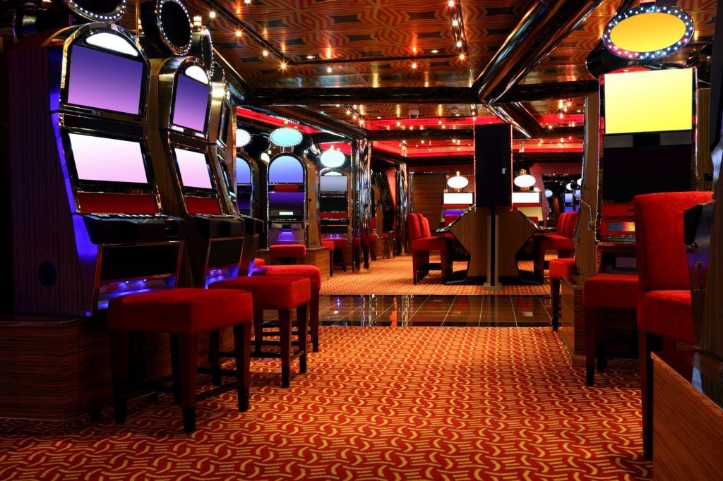
Friedman realized that to maximize the visitor to player ratio there had to be something that appealed to all sensibilities. By having smaller rooms breaking off, it allowed for different vibes and atmospheres to coexist under one roof.
Not only that, it also creates a feeling of intimacy in which players are more inclined to play. In areas with lots of seating, and gaming areas he pushed for low ceilings. This is so there’s no empty space above players’ heads to avoid the lofty, open barn effect.
Again the principle behind smaller, segregated rooms encourages more exploration from players, as you’re more inclined to see what’s behind this next door.
Plus, you can get a taste of different styles without having to switch to another casino.
They Want Your Eyes On The Prize
For Friedman, the players’ attention should be solely on the gaming machines. Passageways should be color coded in such a way that visitors are led directly to machines, rather than providing an easy exit route with games rooms leading off it.
And the machines themselves should be the décor. No need for anything else, according to Friedman, who states that the machines should be the main feature.
Any extra décor should only emphasize the gaming facilities.
Narrow Walkways And Compact Rooms Make You Feel At Home
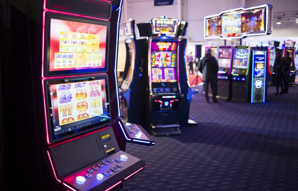
Whilst many small rooms are Friedman’s great concept, he also found that packing them fully optimized success for casinos.
By packing the rooms with machines and keeping walkways narrow it adds to the intimate effect and stops players feeling overwhelmed.
As well as creating the close and intimate feeling, it should be well organized, so players know which section they’re in. He advocates for clear, strategically placed landmarks to help players locate themselves easily in the building.
They Want You To Gamble As Soon As You Arrive
Friedman’s argument is built on the idea that players must be lured in to play from the moment they enter the casino. By having playing stations immediately inside the entrance, it makes it clear to players they’re in a casino.
No space is wasted, and gambling activity is available straight away. With big, hotel style lobbies the player is greeted by vast emptiness, which he argues creates a barn feel, rather than that of a casino.
Roger Thomas And The Modern Playground Casino
Whilst Freidman’s approach to casino design reigned supreme for a long time, the style has been shifting since the publication of his book.
Roger Thomas is known as ‘the man who redesigned Vegas’, who teamed up with Steve Wynn to do up the Bellagio. He threw out all the usual rules and instead centered the focus on how to make players feel.
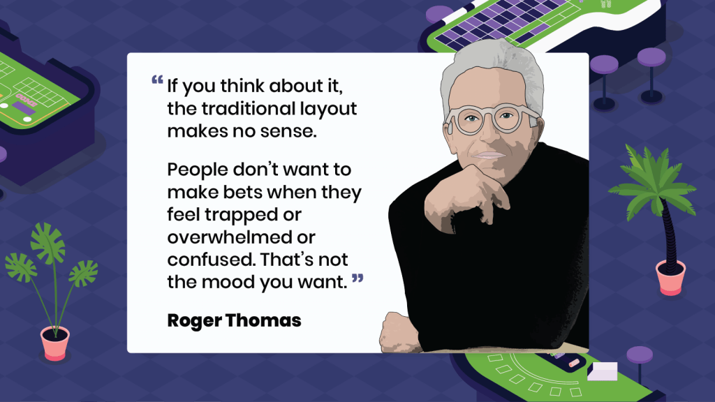
His thinking was that nobody wants to make high-risk bets when they feel trapped in a tiny room with no space to breathe. And with gambling requiring huge amounts of concentration with all the sensory input, it can leave players feeling drained.
In his style of casino design, there’s plenty of opportunity to take a breather and revitalize the spirit. This in turn actually keeps people in casinos for longer, since the environment is all the more pleasant.
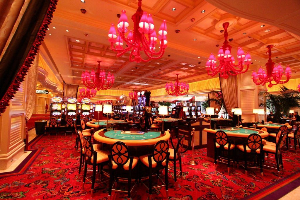
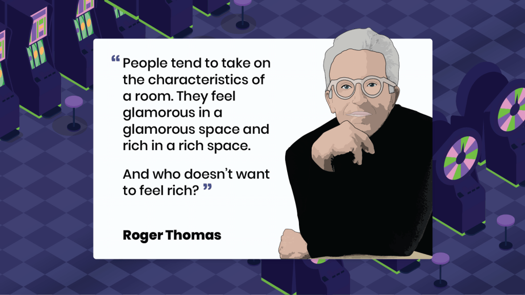
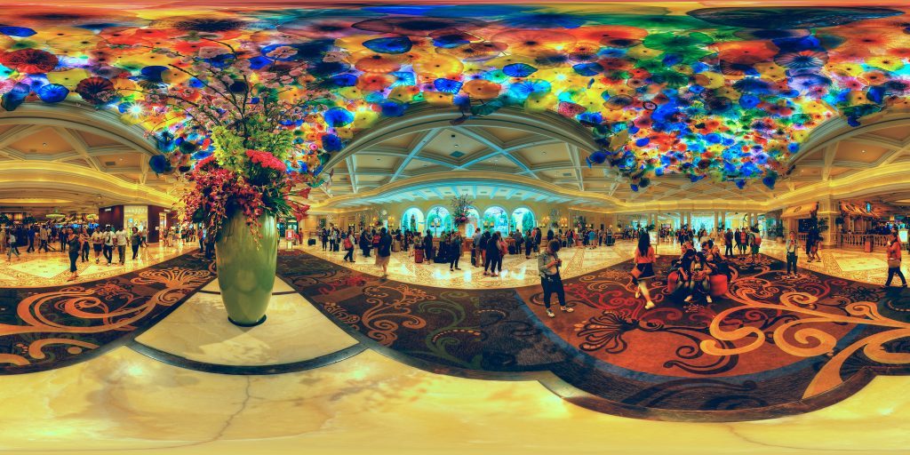
Instead of windowless, boxy rooms he incorporated big, bright open spaces. He literally threw all of Friedman’s rules out of the window.
He opted for high ceilings adorned with beautiful flowing fabrics, skylights to let in the desert state’s glowing sunshine, and European-style furnishings to decorate the gaming halls.
Thomas’s vision was all about inviting players into a relaxed environment, with clear lines of vision and easy-to-navigate spaces so they’d be more inclined to stay, and place riskier bets.
And guess what? It worked!
Now resorts with the money invest in his design layout because it’s what people prefer. People want to head to the casino to let off steam, to have fun, and if the environment is pleasing the whole experience becomes much more enjoyable.
Casinos Play On All Of Your Senses
Casinos are famed for their bright lights and the slot noises of pennies dropping (even though coins stopped being used a long time ago) because these elements all play on the senses.
As humans we like to have the senses engaged and activated and that’s what these methods play on.
In a study carried out in 2006 around aromas, certain smells wafted through the ventilation system increased play in slots by 46%.
Although the study couldn’t pinpoint exactly why this could be, it’s thought that a pleasant smell makes players slow down and are therefore more drawn to playing one of the nearby machines.
The introduction of music has been found to add to the experience, but it seems most effective in the playground design casinos.
In a survey, participants generally recorded a more enjoyable experience at such casinos, stating that they’d be more inclined to stay there longer.
Less Stress = More Spends
The playground design, as Thomas’s design has come to be known, works so well because it focuses on relaxing players in order to boost return. Airports use a similar technique in their layout.
The check-in and security zone are very stressful and fast-paced. So as soon as you’re through to the departure lounge, you’re invited to relax. And spend.
Duty-free and restaurants are on hand as you breathe a sigh of relief at having made it through to the light, open, airy spaces.
The Design Of Online Gambling
So how does all of this translate to the world of online gaming? With the power of architecture and the senses removed, how can online gaming platforms encourage more gaming?

If you’re playing online, your gaming will follow the Friedman approach. Without the opulence or fancy tricks around you, it’s the game alone that draws you in.
Gambling addiction has been found to be more prevalent in a Thomas-style environment. So despite access to playing becoming easier with the launch of online gambling, the number of people with an addiction has remained much the same for the last 35 years.
Whilst playing at home you’re more able to access games, but it quickly wears thin to constantly be alone. In the casino itself you’re part of a community and the frenzied atmosphere swoops you in.
According to a study carried out in 2014, the chances of addiction and suicide are much higher from visiting casino. Whilst playing at home, people show more restraint. Thomas’s playground style really is effective.
Online platforms are working to boost the addictive factor. Fancy avatars and complex rewards systems are in place. As these develop further it’ll be interesting to see if it overtakes offline casinos.
And with the current COVID-19 pandemic, will fewer people want to get their gambling fix surrounded by other people? Time will tell.
Sources:
Stripping Las Vegas: A Contextual Review of Casino Resort Architecture Ed. By Karin Jaschke & S. Ötsch (2003)
Designing Casinos to Dominate the Competition: The Friedman International Standards of Casino Design by Bill Friedman (2000)
A Comparison of Online Versus Offline Gambling Harm in Portuguese Pathological Gamblers: An Empirical Study by Pedro Hubert & Mark D. Griffiths (2018)
Disordered Gambling: Etiology, Trajectory and Clinical Considerations by Howard J. Shaffer, Ph.D. & Ryan Martin, Ph.D.
https://io9.gizmodo.com/how-casinos-use-design-psychology-to-get-you-to-gamble-1667182023
https://www.newyorker.com/magazine/2012/03/26/royal-flush-2
Lead image: ‘The Venetian Macao The Great Hall’ by WiNG is licensed under CC BY 3.0
